Film/Music Mixer


Once you approached the film/music mixer after being attracted to it by its big screen all you do is press the "try me" button on the top left of the left control panel. On pressing this you receive simple on screen instructions to "Press the play button to watch the film".
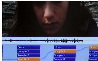
 The play button is green and is place on the right-hand control panel. It looks like the standard play button that we’re used to on CD/DVD players. Once you’ve pressed it the movie starts to play on the LCD screen on the wall. As you watch it you can see the rate of play in the timeline and it also shows you the audio waveform of the music tracks that you can choose to play along to the video.
The main point of the exhibit is to get you to interact with what music is playing along with the video by using the 8 buttons above the play button. The video and audio is split up into 4 segments and by using 2 of the buttons that line up with that segment you can choose between having no music or a choose 1 of the 3 different music tracks in that particular segment.
The user learns how to use the exhibit after the initial instructions by trial and error. You press the buttons on the control panel above the play button and you get immediate visual feedback on screen (where you can see that the track has changed) and audio feedback (you hear a different music track or no music at all).
The target audience as with most of the exhibits on the top floor is older kids – teenagers and young adults. This has influenced the design in that instead of using bright primary colours to attract the user they’ve used orange and purple and a big screen. The interface on screen uses visual cues linked to the music that younger kids are unlikely to understand or appreciate fully, especially the audio waveforms.
The film/music mixer is fun to use, simple to learn (you get immediate visual and audio feedback after pressing a button) and it gives you an insight into how music video’s and film scores are put together which should appeal to the MTV/Ipod generation or whatever they’re called now.
In regards to HCI (human computer interaction) and usability I would say that it was
• Easy to learn and use.
• Memorable, in the fact that you wouldn’t have to relearn a difficult process
• Useful as a teaching and entertainment device
• Flexible, all in all you have 16 options of where you link the music or lack of music to the video.
• Efficient, you only have 4 states to choose from at a time in each of the 4 segments and the only mistake you can really make is not doing anything at all.
• Enjoyable to use and entertaining.
• Good to look at.
I think the exhibits lack of instruction bar “press the play button” encourages a general button bashing and self learning experimentation which aids interaction with the exhibit.

gogglevideo
