LEA Vol 14 No 3 July 2006
http://leoalmanac.org/journal/vol_14/lea_v14_n03-04/intro.asp
Saturday, November 11, 2006
Friday, November 10, 2006
ADM302 – User Centred Design Assignment
BA/BSc Design for Interactive Media (Top-up) 2006/07
ADM302 – User Centred Design
By Nigel Whitbread
Stage Two - TestingADM302 – User Centred Design
By Nigel Whitbread
In this part of the assignment we are required to evaluate our re-designed prototypes using Neilson's Discounted Usability Engineering Method (DUE). To aid me in this I tested my redesign on a selected user group of my family members from a wide age range.
Testing framework following Neilson’s Discounted Usability Method (DUE).
The DUE approach is intended to keep costs as low as possible for testers with limited resources and because of this should be viewed as a way of serving the user community.
The process I followed for the user testing of my prototype is as follows
• I typed up a scenario describing the path I wanted my users to follow through the interface I’d designed in Flash. Because of the limited functions in place on the prototype this was a fairly rigid way of testing.
• Before I went on to full testing I tried out different ways of delivering the scenario, first of all I talked a user through the stage of the scenario whilst showing them myself how the prototype worked. This approach was quicker then the others but I received less direct feedback because I’d explained everything as I went along.
• I then gave a user the scenario to read a follow but soon found that the scenario was more or less ignored as they tried to work the interface be random button hitting and self discovery. Because not all the functions were working this lead to a lot of errors.
• Taking these two trial runs on board I asked 5 users from my family to test the prototype. (Tognazinni (1993) and Redmond-Pyle & Moore (1995) suggest that three users can give the evaluator a good idea of what users in general might think and that after three there may be diminishing returns from involving additional users. Monk (1993) suggests five users)
• The methodology I’ve chosen for my main user testing is based on Cooperative Evaluation developed by Monk et al (1993). Its aim is quite simply to identify problems with the system. Instead of having the users read through the scenario as the work their way through the prototype I decided to read it out to them and have them work through every stage one step at a time. I also had the users think out loud their actions and encouraged them to ask questions, list the problems they encountered and comment about the user experience.

Users interaction with the prototype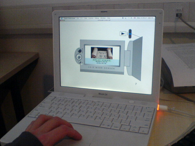
Heuristic Evaluation
Using Jacob Nielsen’s heuristic evaluation of the original and redesign.
Using Jacob Nielsen’s heuristic evaluation of the original and redesign.
- Icons used in the menu structure are sometimes vague and don’t relate well to what their supposed to be symbolising (2. Match between system and the real world),
- No accelerator functions to allow expert users to short cut or tailor frequent actions (7. Flexibility and efficiency of use),
- Camcorder doesn’t contain any integral help functions and the users manual isn’t easy to search through (10. Help and documentation)
http://uwicworkinprogress.moonfruit.com/
Thursday, November 09, 2006
ADM302 – User Centred Design Assignment
BA/BSc Design for Interactive Media (Top-up) 2006/07
ADM302 – User Centred Design
By Nigel Whitbread
ADM302 – User Centred Design
By Nigel Whitbread
Stage One – Redesign
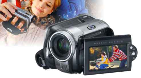
The product that I reviewed and I am now redesigning is JVC's GZ-MG26 Everio Hard Disk Camcorder. It is portable (handheld and compact), and has a multimedia interface (display screen).
When I analysed the product I found that its editing capabilities were extremely limited, all you could really do in-camera was reorder your movie scenes by creating a playlist. Because the online advertising for this camera claimed you could edit in-camera, I asked people what they expected when they read this, and the views I received were - simple editing, cutting scenes up, and deletion of unwanted scenes. This kind of approach seemed to make sense to me especially as seeing you could attach the camcorder directly to a DVD burner, therefore bypassing a PC that could contain software incorporating these simple editing techniques.
Donald Norman describes in his book “The Design Of Everyday Things” what he deems ‘good’ and ‘bad’ design through case studies and proposes design principles. He extols the importance of design in our everyday lives, and the consequences of errors caused by bad design. He also goes on to talk about designing with the user in mind, simplifying the structure of tasks, making things visible, getting the mapping right, exploiting the powers of constraint, and designing for error.
I have tried to take these principle in to consideration whilst working on my redesign.
I started the redesign by choosing to change the way you edit and alter the style of the menu interface to make it more similar to a mobile phone interface. The users of the camcorder (families, kids, anybody really but the size of the camcorder might put off the visually impaired) should relate well to the mobile phone design metaphor as they should be the same type of user. The Sony Ericsson range of phones also has similar video editing capabilities to my proposed design.
I started off using a low fidelity prototype to get my ideas flowing and straight onto paper in their simplest terms. I used yellow post-it notes for their ease of use and because you can move them around and reposition them in different orders.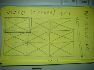
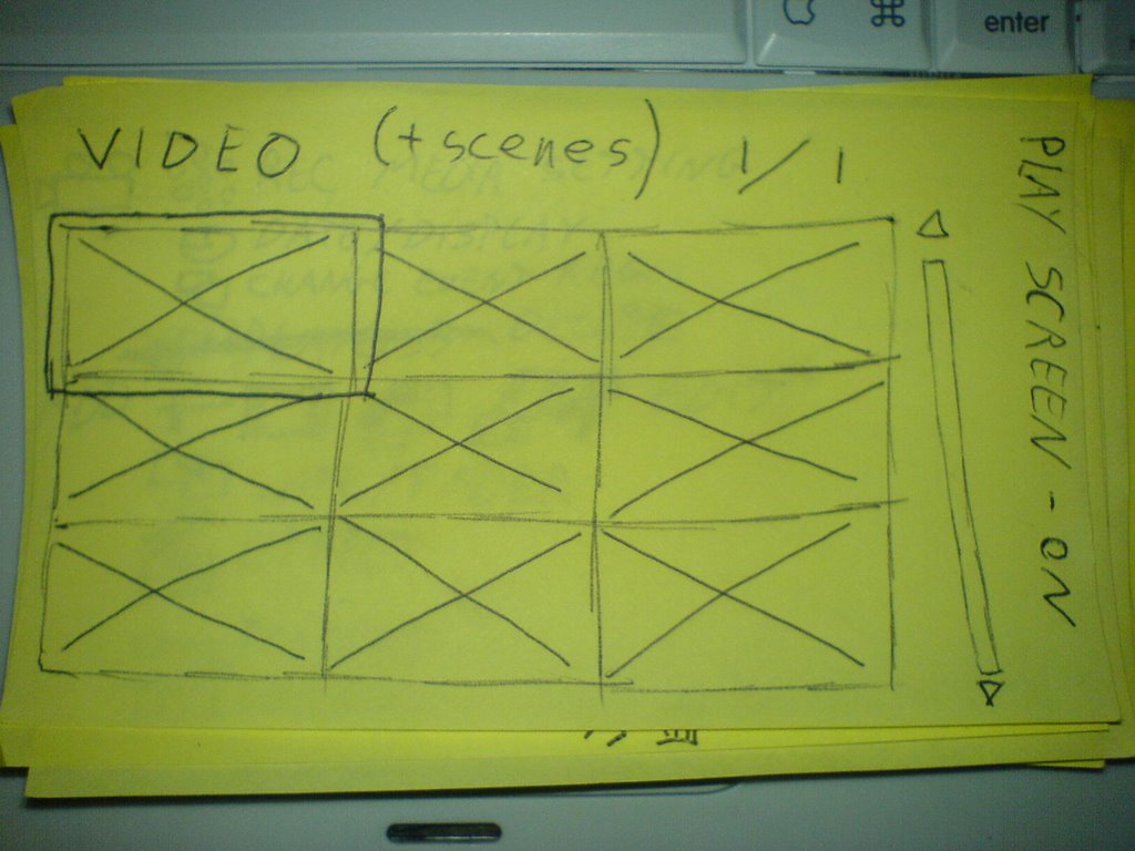
Start up screen on the camcorder as scetched out on post-it note
New MENU interface set up in the same style as many mpbile phones
Doing this helped me plan out the vertical functionality and fine-tune the functions I wanted to represent. I then designed a high fidelity prototype in Flash to give user testers a more realistic experience when testing it.

High fidelity Flash prototype
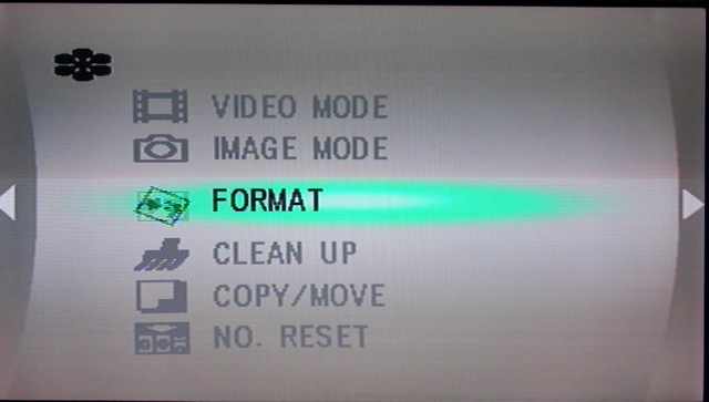
Original Menu
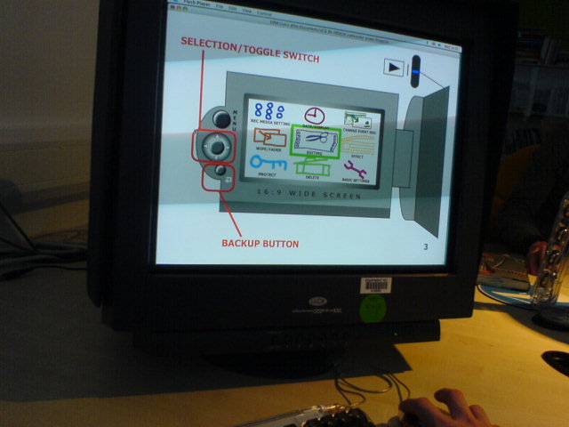
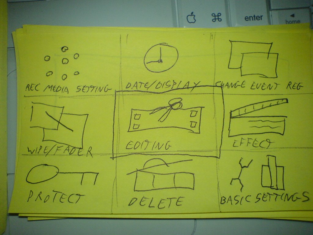
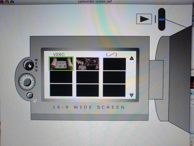
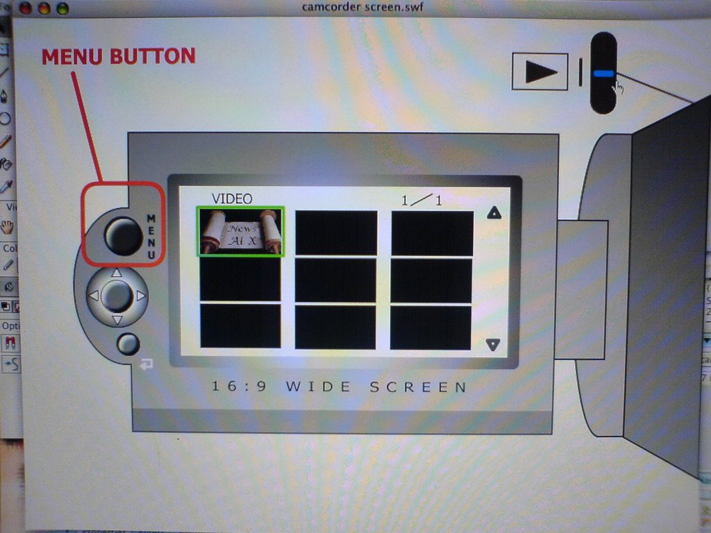
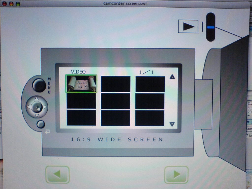
My redesign of the MENU splits the screen up into nine squares so that all of the options are visible and I’ve made the icons larger for better visability.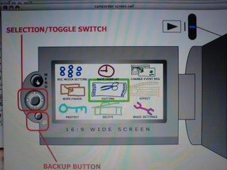
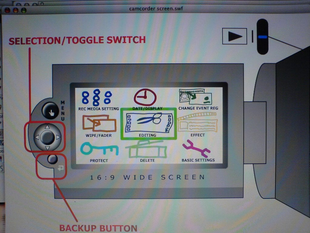
Redesigned MENU
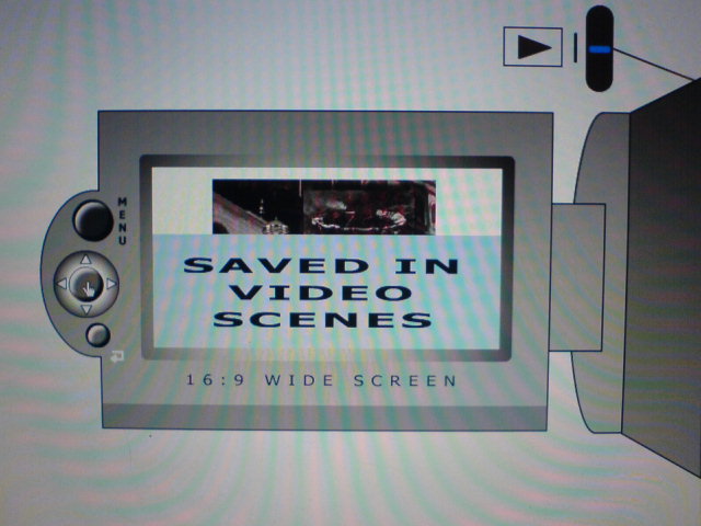
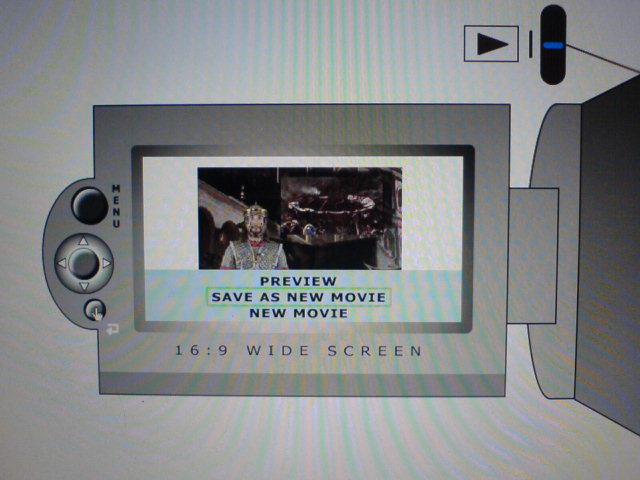
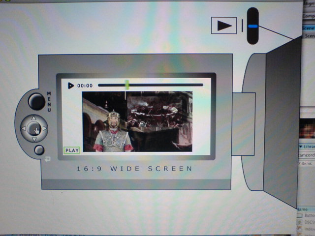
For the Editing function as I said earlier I took inspiration from Sony Ericsson phones and some elements from iMovie. I got rid of the playlist function from the original product and introduced an editing function instead. Under the new system you’ll be able to split movie scenes, delete the old or new scenes, reorder scenes (as in the original camcorder), preview scenes as your working on them and save changes as you go along. Doing these editing tasks in-camera could save you having to do any other further editing on a PC so you could burn straight to DVD if you had a DVD burner.
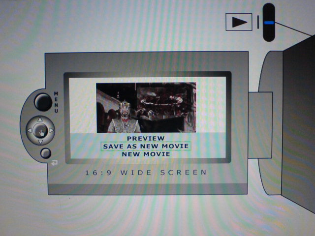 New editing functions showing users feedback and some of your options
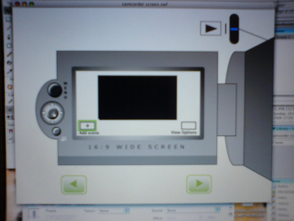
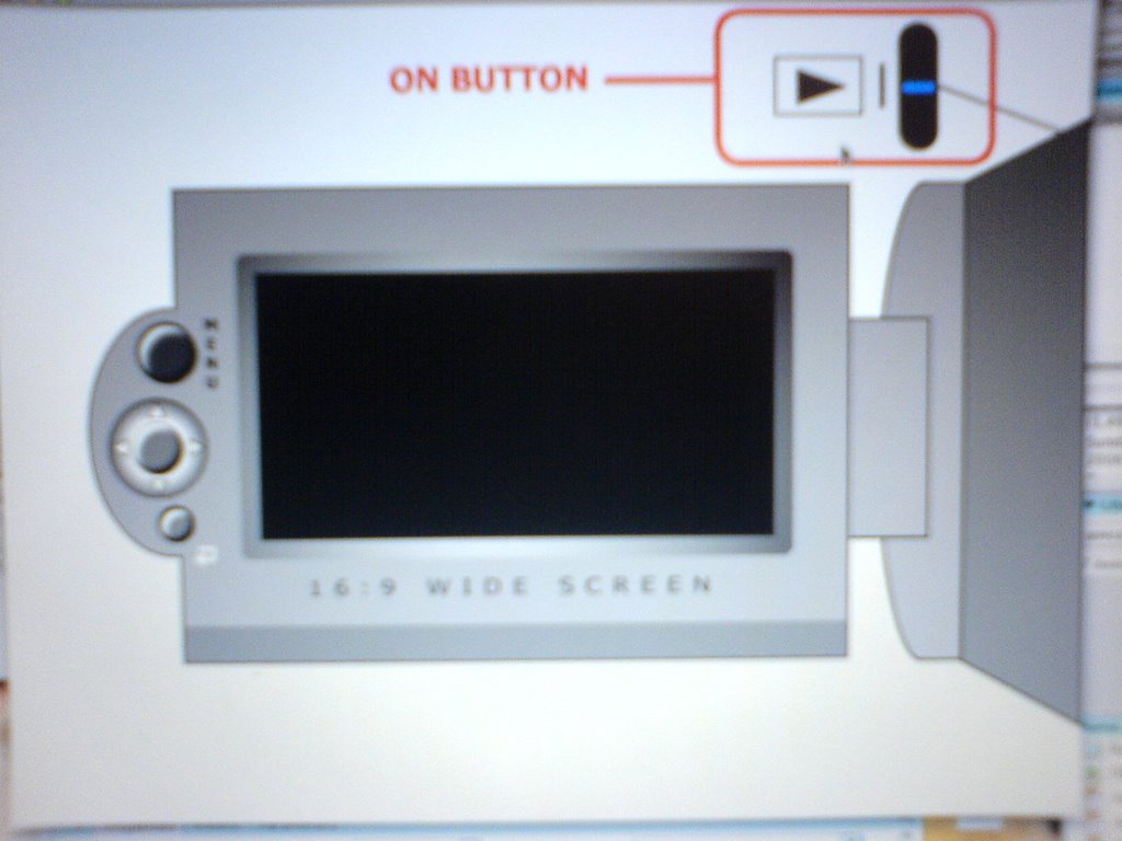
I also moved the MENU button from the inside of the casing to the left hand side of the screen, above the other buttons, so that when you close the screen with it facing out you are still able to use all of the MENU functions. You were unable to do this before, because the screen covered it.
If I’d had more I time I would have introduced some kind of help function as on websites or a demo video of how to use the functions so that if you forgot how to use a certain function, you’d be able to find out directly from the camera (which has a 20GB hard drive) instead of having to look for your users manual (which invariable gets lost or thrown away).
If I’d had more I time I would have introduced some kind of help function as on websites or a demo video of how to use the functions so that if you forgot how to use a certain function, you’d be able to find out directly from the camera (which has a 20GB hard drive) instead of having to look for your users manual (which invariable gets lost or thrown away).
Wednesday, November 08, 2006
Tuesday, November 07, 2006


Back from Stag Do in Prague
Back from a long, long, long weekend in Prague where fun was had by all. will post photo's when I get them.
Subscribe to:
Posts (Atom)

